Handwriting
Posted: , Updated: Category: Essay Category: PensOne part of my job involves hand-writing calculations on bits of paper that will be read by other people. Another part of my job involves using a red pen to make corrections on technical drawings.
In both of these communications tasks it’s vital that every number and letter is 100% legible. As such, it’s interesting to look at how I have trained myself to write in these situations.
Numerals
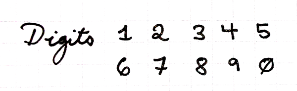
All of my numerals are very distinct from each other and from easily confused letters.
- `1` is drawn with cap and base strokes to distinguish it from the lowercase L (`l`).
- `2` has a distinct loop on it to distinguish it from lowercase `z`.
- `5` has distinct angular corners, so you can’t confuse it for a letter `S`.
- `7` has a cross-mark on it to distinguish it from the `1`.
- `0` is drawn with a slash mark to distinguish it from the letter `O`. (Sometimes I forget to do this.)
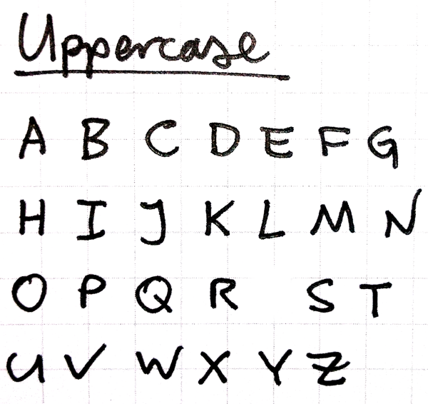
Letters
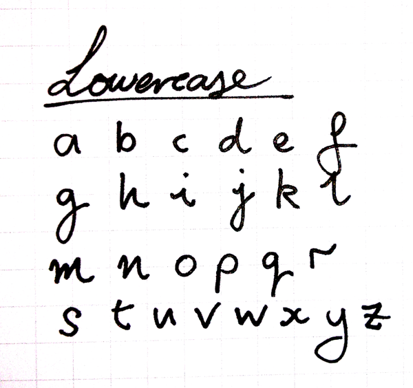
- Lowercase `i` is drawn with two little serifs, which makes it distinct from a lazy man’s `1` or `l`.
- Lowercase `f` is a loopy affair, so it can’t be confused with lowercase `t` or plus symbol `+`.
- Uppercase `G` gets a definite angular stem to distinguish it from capital `C`.
- Uppercase `I` gets large top and bottom strokes to distinguish it from lowercase `l` and numeral `1`.
- Lowercase `l` is drawn either with a loopy bit or with two serifs, which distinguish it from the numeral `1`.
- `S` and `s` are written with very exaggerated round curves so they can’t be mistaken for a `5`.
- Lowercase `t` picks up a distinct, round tail, so it looks different from the plus symbol `+`.
- `u` and `v` are easy to confuse. `u` gets an exaggerated round bowl and a distinct stem. `v` gets a distinct angular corner.
- Lowercase `x` is written with curvy strokes so as not to be confused with a multiplication symbol, `×`.
- When using `z` or `Z` as symbols, I draw `z` with a cross-stroke to distinguish it from `2`. (I use a faster version of lowercase `z` when writing text.)
I adhere to these rather strictly when writing individual symbols, but less strictly when writing complete words or sentences.
In other media
These precise communication habits extend to more than just my handwriting.
When communicating exact text in a document, I typeset it in a fixed-width font like Courier New or Consolas so that all the characters can be accurately read. This is the difference between:
Oo0o0O00o0o00
ll|1iIl1|lIIl1||li1l1lL|I
and
Oo0o0O00o0o00 ll|1iIl1|lIIl1||li1l1lL|I
When on the phone, I use the NATO phonetic alphabet to spell out difficult information like license plate numbers, part numbers, and my own name. Using “Alpha, bravo, charlie, delta…” to spell letters is a clear improvement over improvisations like “A as in, err, apple, B as in, um, Beef…”. The use of niner instead of nine, and tree instead of three, requires a bit more explanation sometimes.
The general trend of being precise in my communication extends even further to my sentence structure and choice of words; but that’s a topic for another time.
2016-12-28: There’s apparently a German standard, DIN 1450, for legibility in fonts.
The recent German DIN 1450 legibility standard recommends several features for font legibility, including differentiation of letter shapes to reduce confusion. The Go fonts conform to the 1450 standard by carefully differentiating zero from capital O; numeral 1 from capital I (eye) and lowercase l (ell); numeral 5 from capital S; and numeral 8 from capital B. The shapes of bowls of b d p q follow the natural asymmetries of legible Renaissance handwriting, aiding differentiation to reduce confusion. [5]